Designing trust into a small community water system.
A detailed UX case study about turning a residential water-service problem into a connected product story: clearer outage communication for residents and stronger preventive maintenance for the people keeping the system running.
The project began as a request for water alerts. Research showed the real challenge was a service loop: residents needed clarity during disruptions, admins needed a reliable communication path, and technicians needed maintenance routines that could prevent the next disruption.
A small residential water system was asking for more than an alert app.
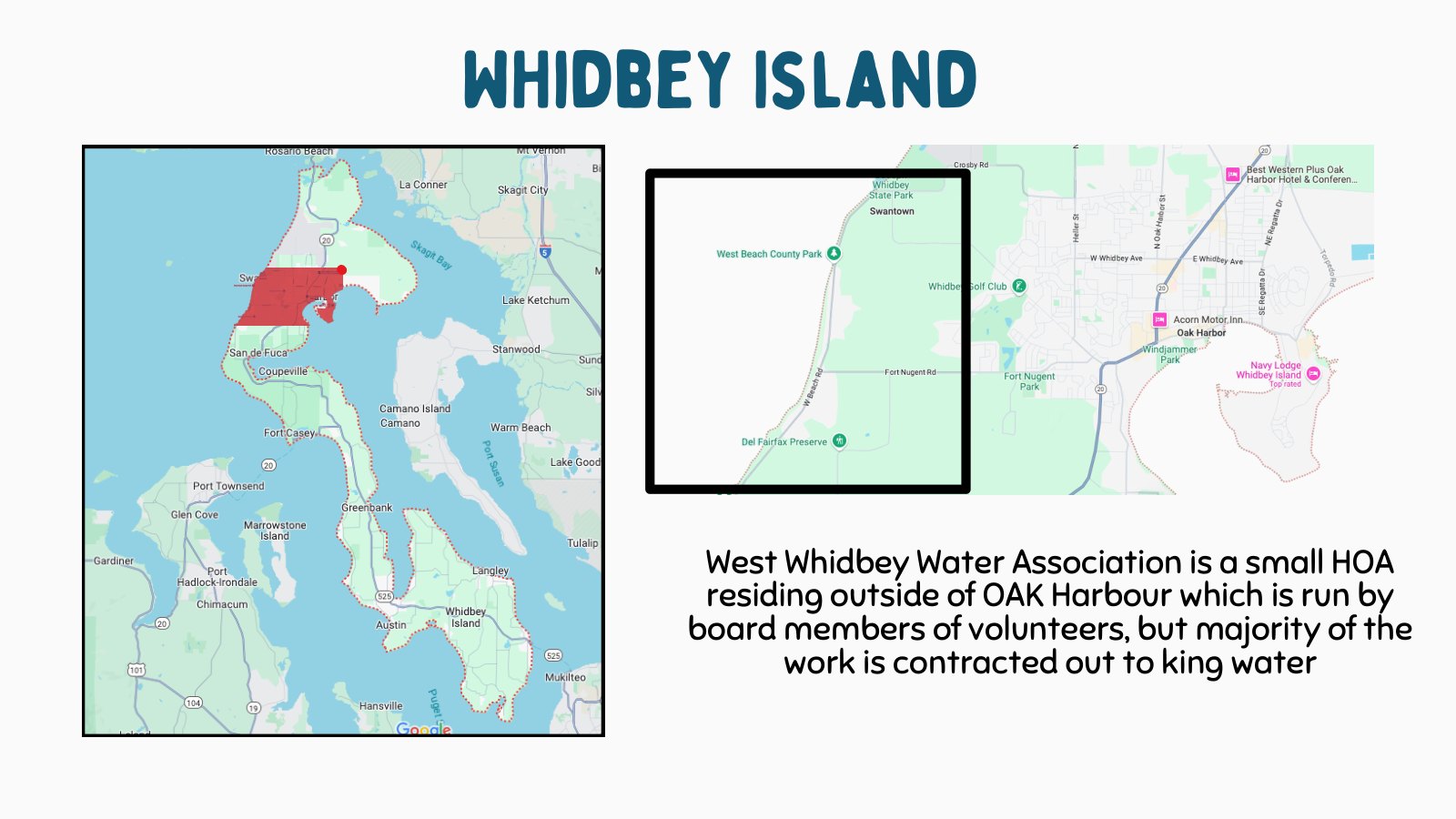
West Whidbey Water Association serves a residential community where water service is personal, local, and fragile. When water stops, pressure drops, testing happens, or maintenance interrupts service, the problem becomes emotional before it becomes technical: people want to know what happened, whether it affects their home, and what they should do next.
The first reframing was important. This was not simply a notification product. It was a service design problem connecting residents, system administrators, board stakeholders, field technicians, and the physical water infrastructure.
A local water association serving a residential island community.
Outages and maintenance created confusion when communication was not immediate or centralized.
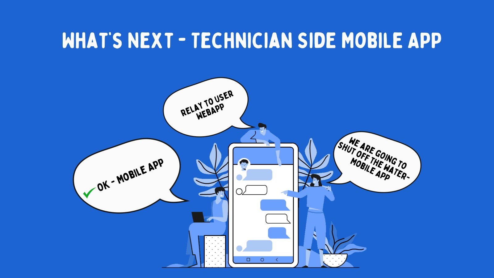
Outage communication for today, preventive maintenance for tomorrow.
Frame the case study around two connected challenges: communication during water events and prevention through maintenance routines.
The story became a resident-facing and operations-facing service journey, not just a set of app screens.
Water issues were showing up as resident confusion before they became product requirements.
The visible problem was that residents needed better alerts. The deeper problem was that water events moved through a scattered chain: someone noticed an issue, someone else had to explain it, another person might need to inspect equipment, and residents were left trying to understand what was happening from partial information.
I treated the outage moment as the center of the story. A resident does not care whether the root cause is maintenance, equipment, testing, or a line issue. They care about clarity: Is my water safe? Is service down? Who knows about it? When will it be resolved?
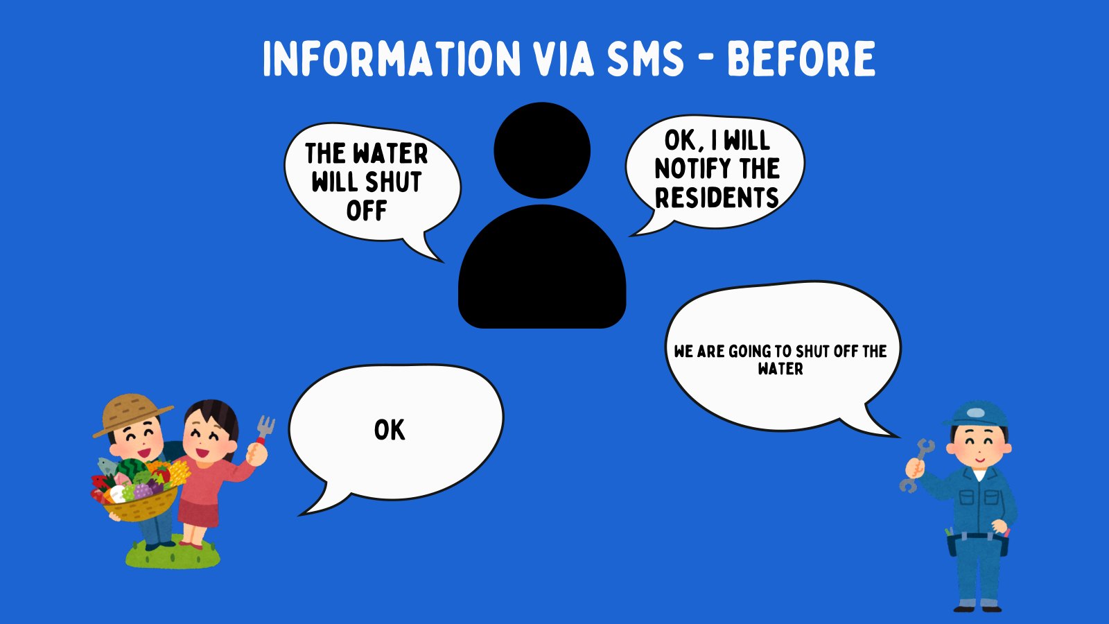
Before
Communication relied on manual relay, SMS-style updates, and unclear ownership.
During
Residents needed status, instructions, and confidence that the issue was known.
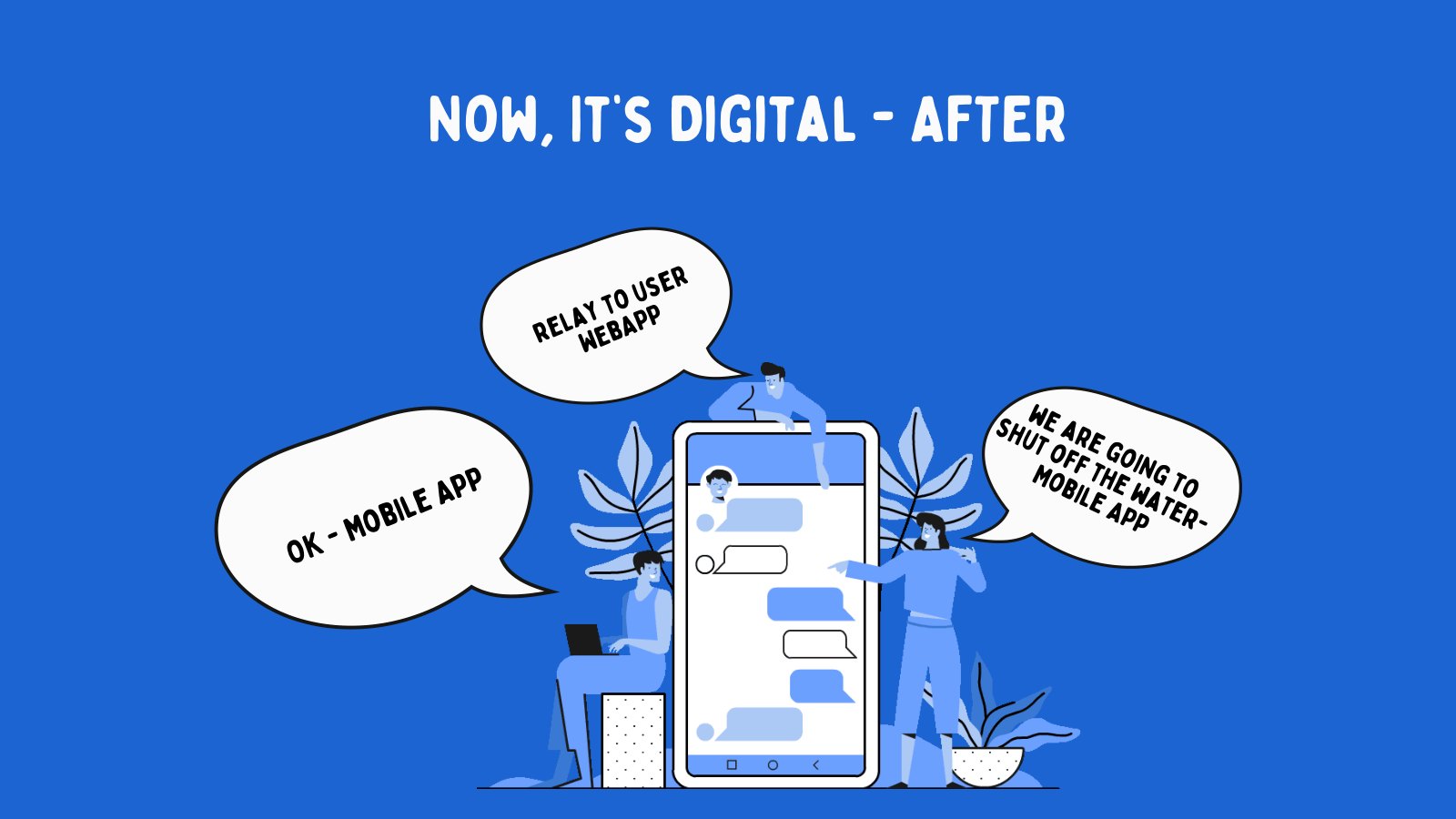
After
The system needed a record of what happened so future events could be handled better.
Design the outage experience as a loop: detect issue, notify residents, collect reports, resolve, and learn from the event.
The communication problem became operational, which made the solution more useful than a basic alert blast.
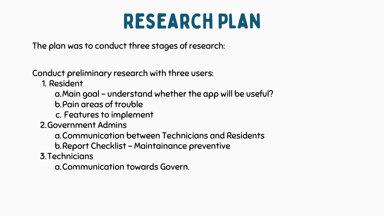
The research had to cover people, operations, and the physical water system.
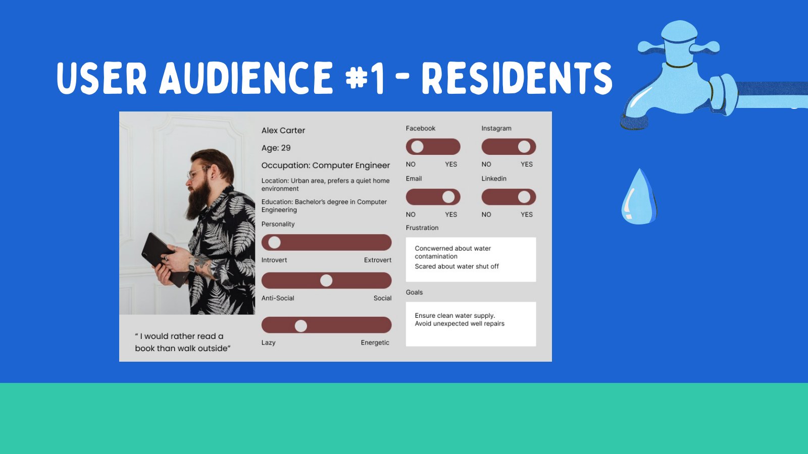
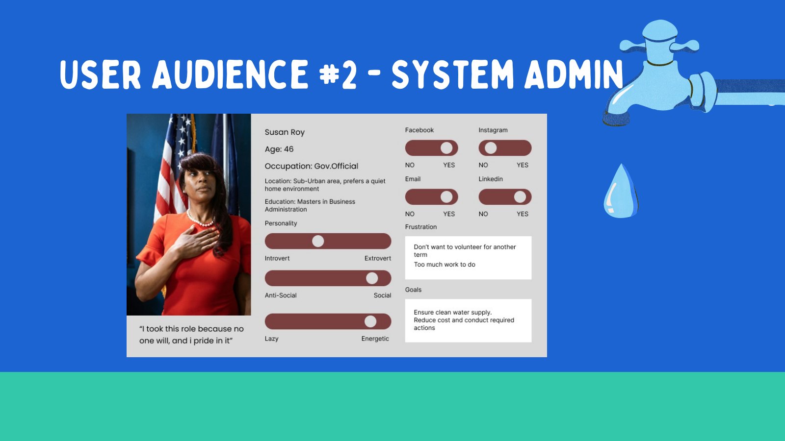
I organized the research around three audiences because each one touched a different part of the water experience. Residents experienced the disruption. Administrators carried communication responsibility. Technicians understood the equipment and the maintenance reality behind the disruption.
This gave the project a clearer method: do not start with screens. First understand who needs information, who sends information, who acts on it, and where the physical water system can fail or need preventive checks.
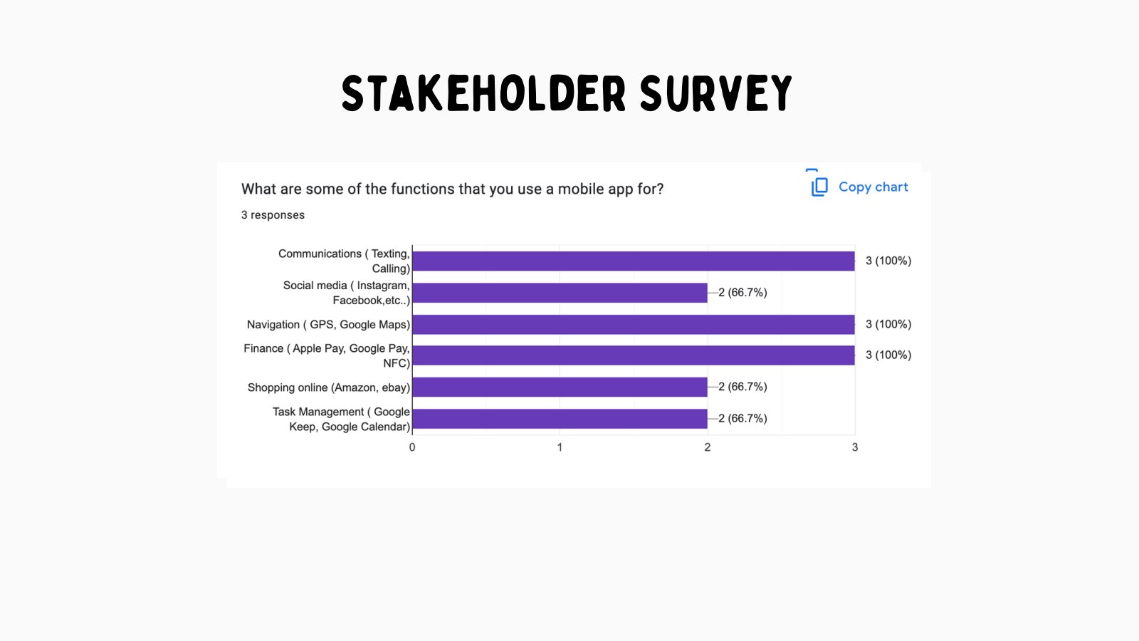
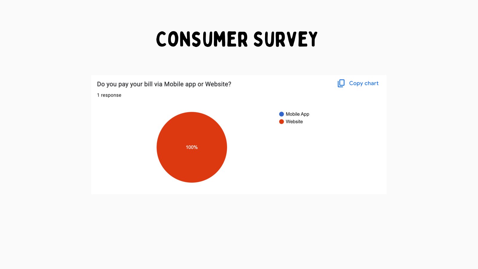
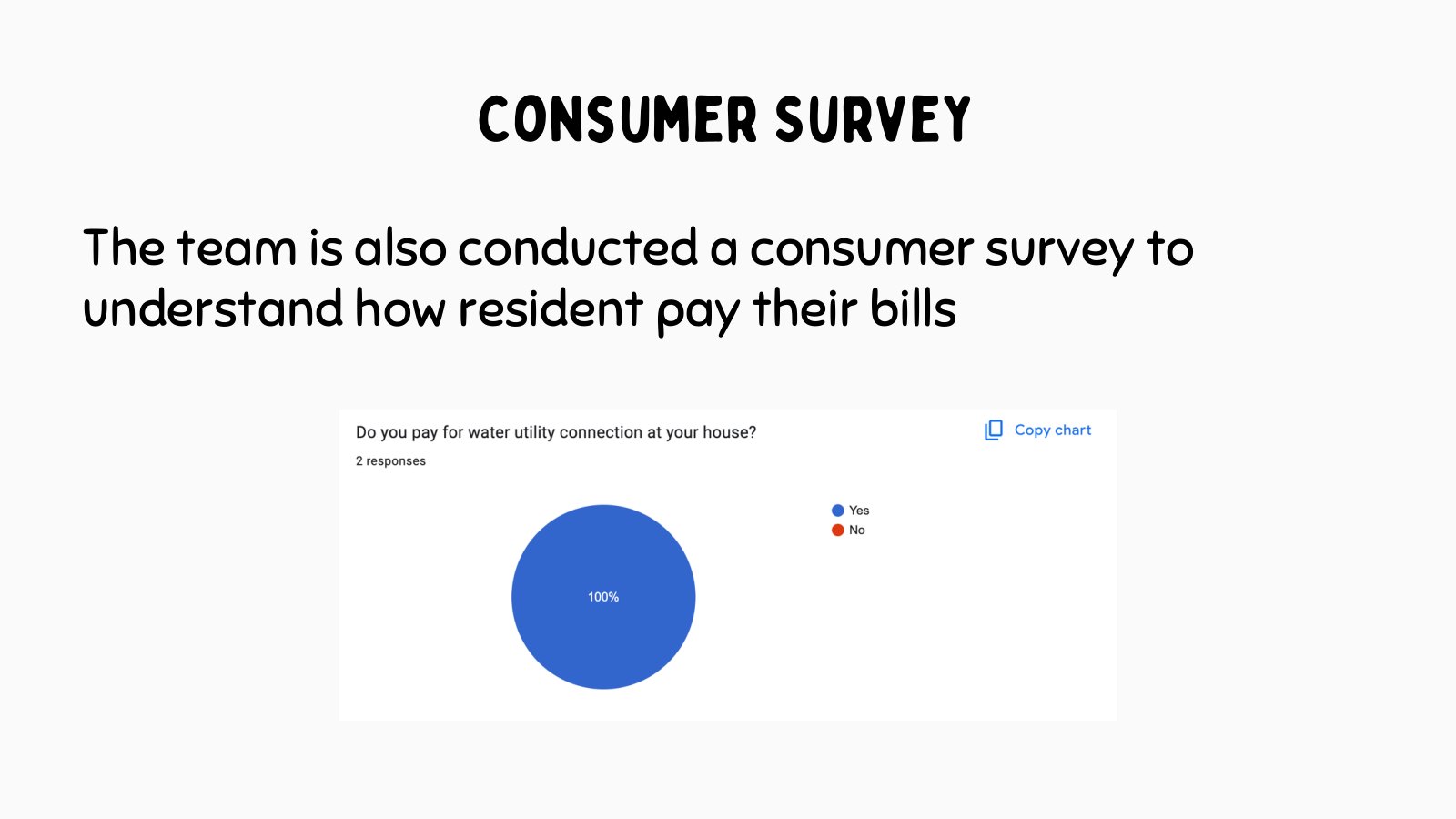
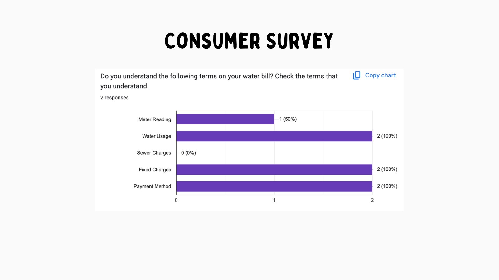
Google survey material helped validate which features residents and stakeholders cared about.
Figma personas captured the needs of residents, admins, and technicians.
Existing maintenance documents and equipment visuals grounded the checklist work.
Use research outputs as product filters: every feature had to help residents understand issues, help admins communicate, or help technicians prevent future problems.
The research gave the case study a system map instead of a narrow app-feature list.
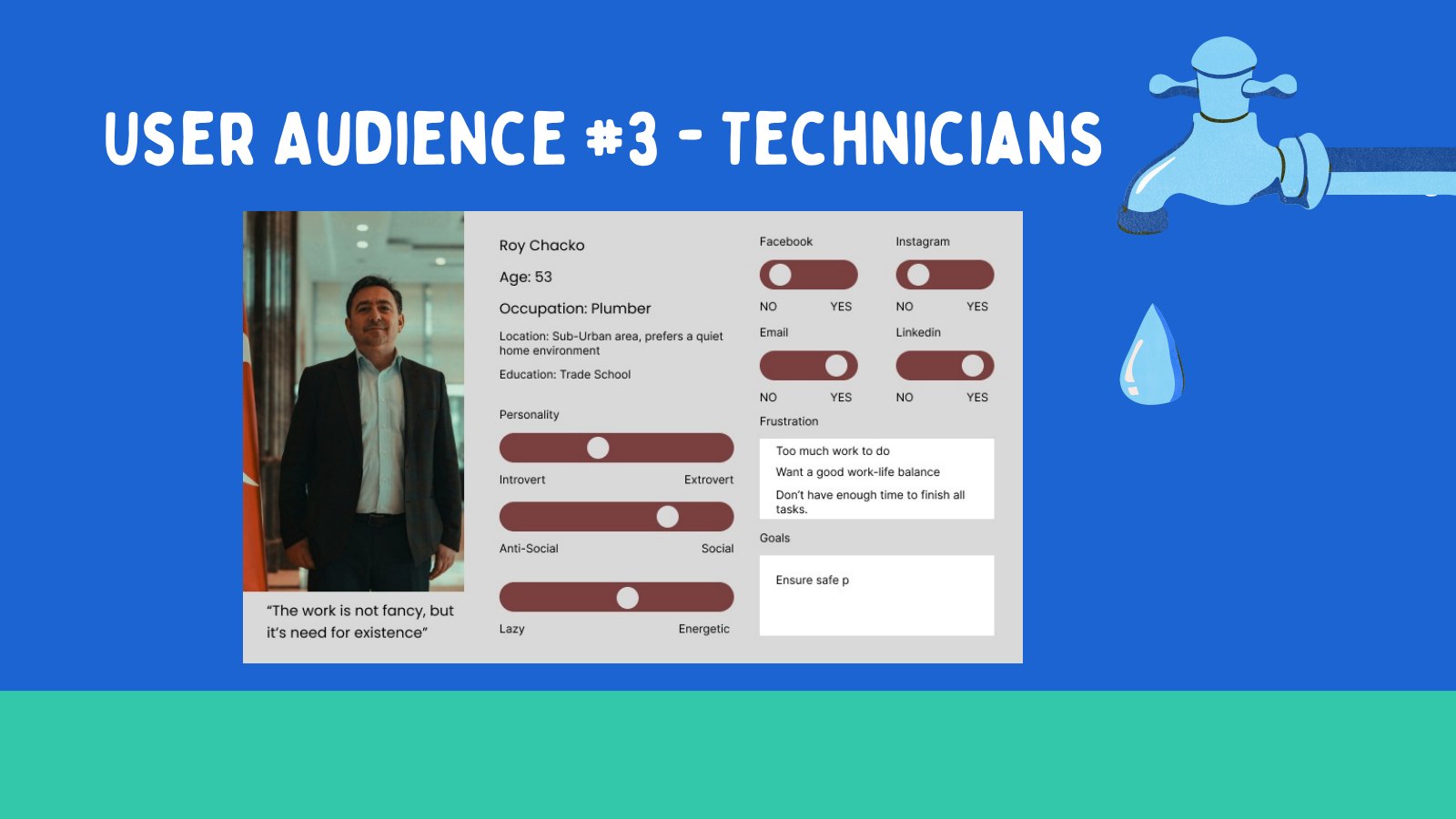
Three personas explained why one app needed three different kinds of clarity.
The personas were not decorative. They helped explain the design tradeoffs. A resident needed plain language and trust. A system admin needed control and speed. A technician needed structured tasks that worked in the field and did not add unnecessary admin burden.
When those needs were placed side by side, the product direction became easier to defend. A resident-facing app alone would not prevent repeat confusion. A technician checklist alone would not help residents during an outage. The value came from connecting both sides.
Resident
Needs immediate outage updates, simple issue reporting, and guidance without technical jargon.
System admin
Needs a reliable way to broadcast updates, manage incoming reports, and keep communication consistent.
Technician
Needs a repeatable checklist tied to hydrants, tanks, pumps, labels, and equipment checks.
Build the narrative around a shared service ecosystem rather than separate resident, admin, and technician products.
The personas clarified why communication and maintenance had to be designed as one connected experience.
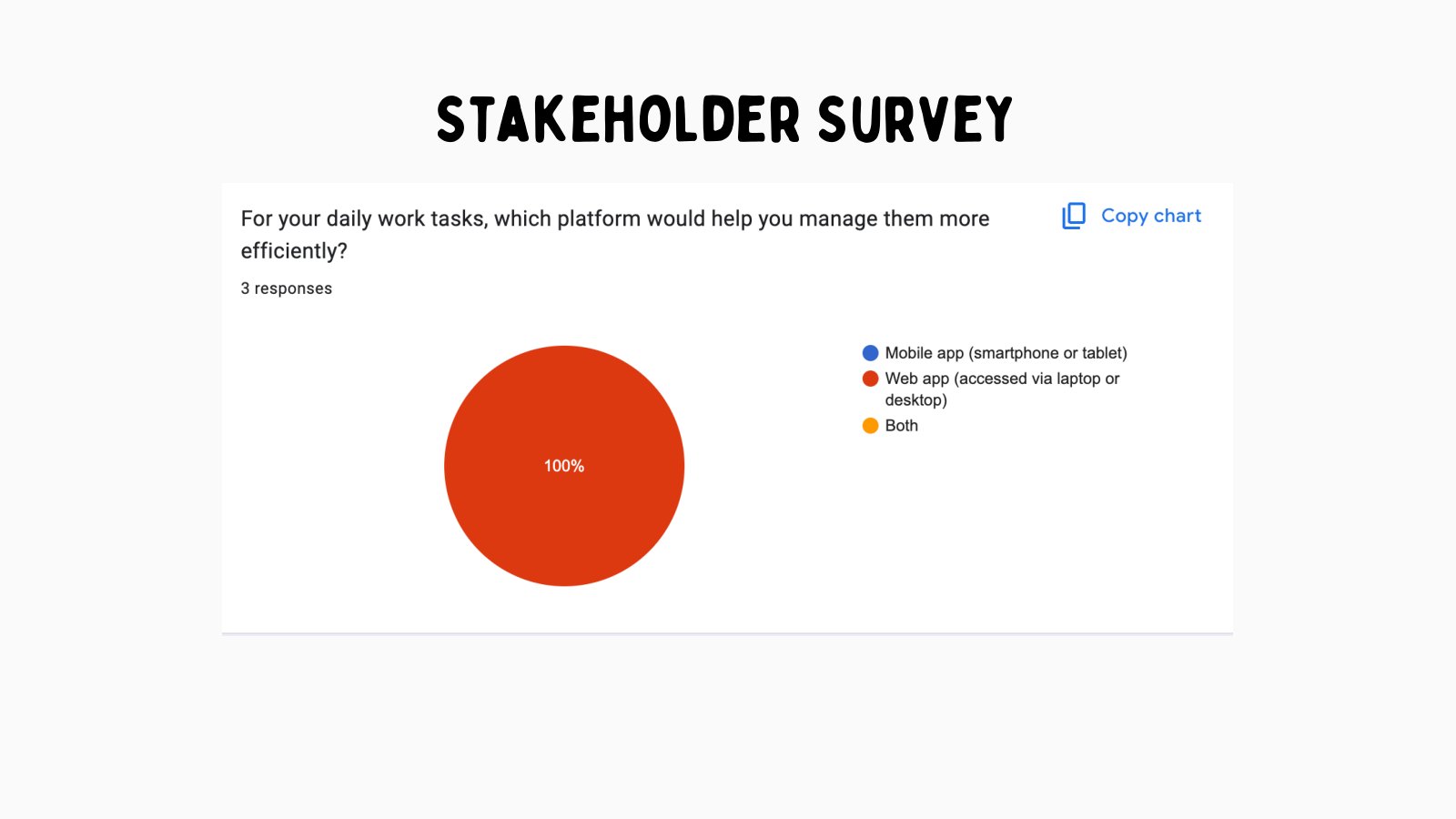
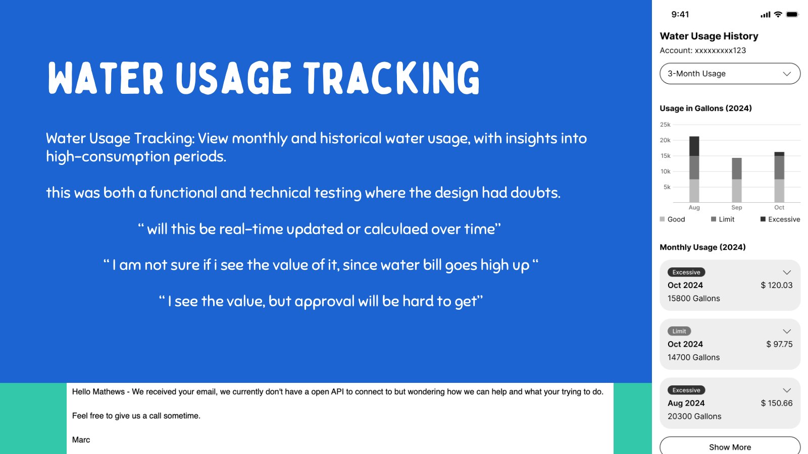
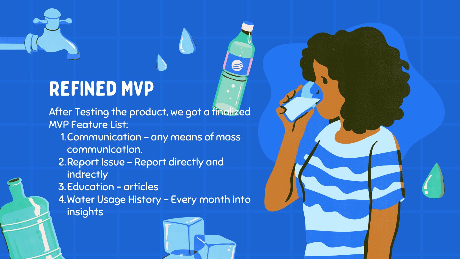
Survey data narrowed the MVP around the moments residents would actually use.
The survey material helped separate urgent utility needs from nice-to-have portal features. Billing and water usage had value, but they were not the highest-impact starting point because many residents already had ways to pay or manage bills. Water-event communication, issue reporting, and relevant education were closer to the moments of confusion.
This is where the MVP became sharper. Instead of asking the app to solve every utility task, the product needed to support the urgent resident moment: something is wrong with my water, and I need clear information quickly.
Alerts and messaging directly reduced uncertainty during water events.
Resident reports could turn confusion into useful operational signal.
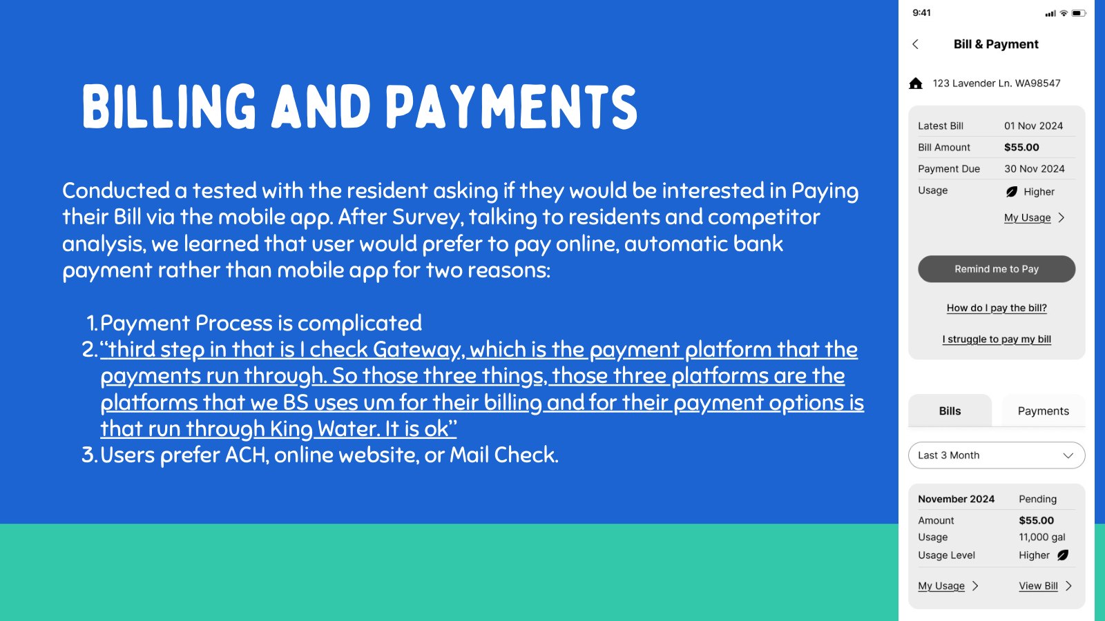
Billing was less central because existing payment behavior already worked for many residents.
Usage tracking was useful context, but not the first-order outage problem.
Prioritize the features closest to outage clarity and maintenance prevention: alerts, reporting, education, and checklist workflows.
The app became smaller, clearer, and easier to explain as an MVP.
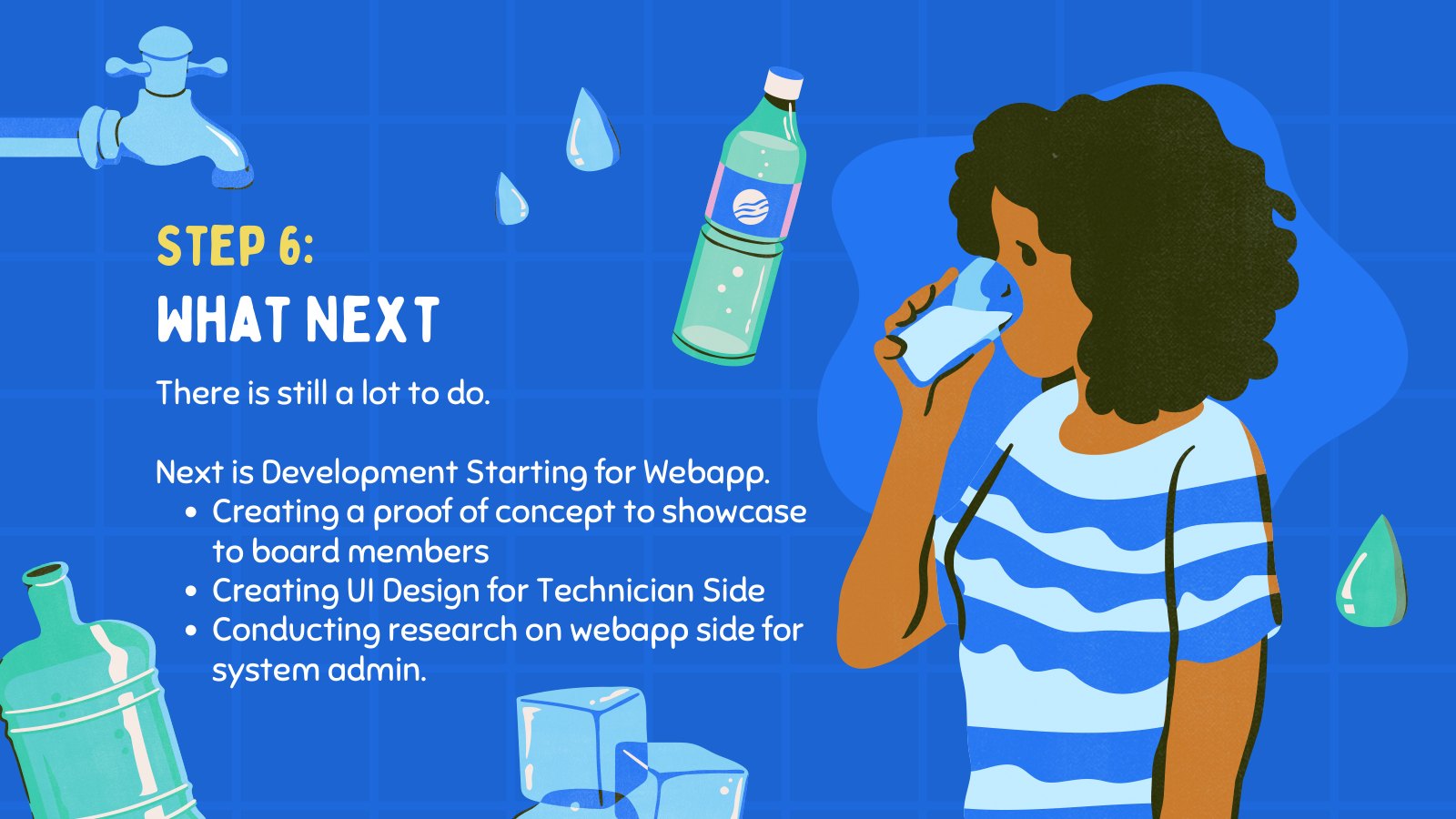
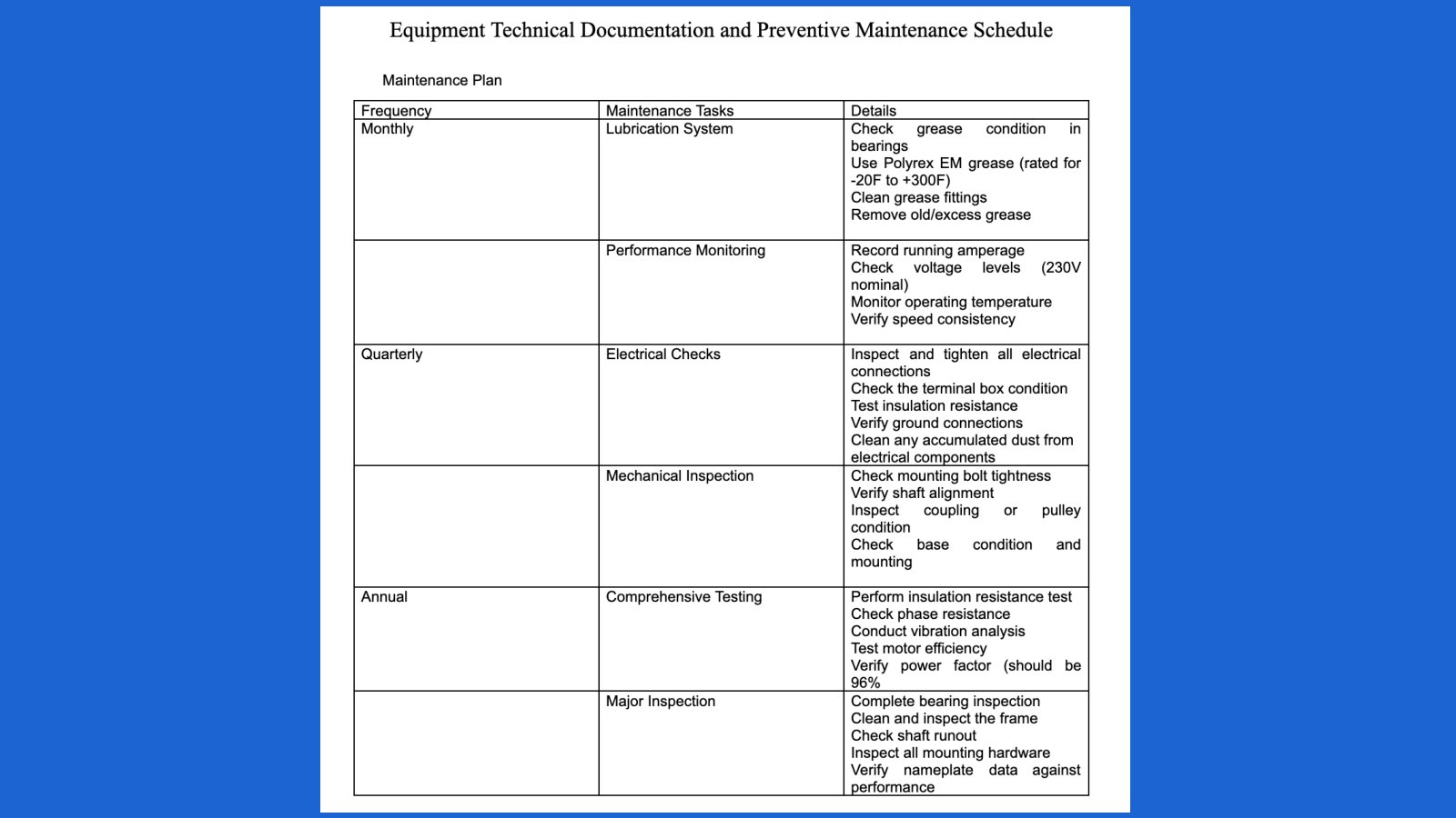
The maintenance checklist translated engineering knowledge into repeatable field action.
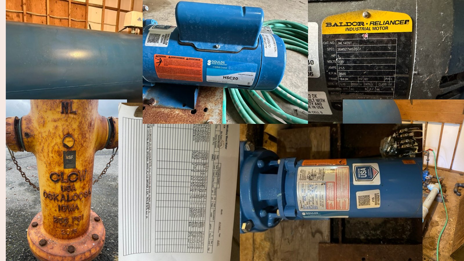
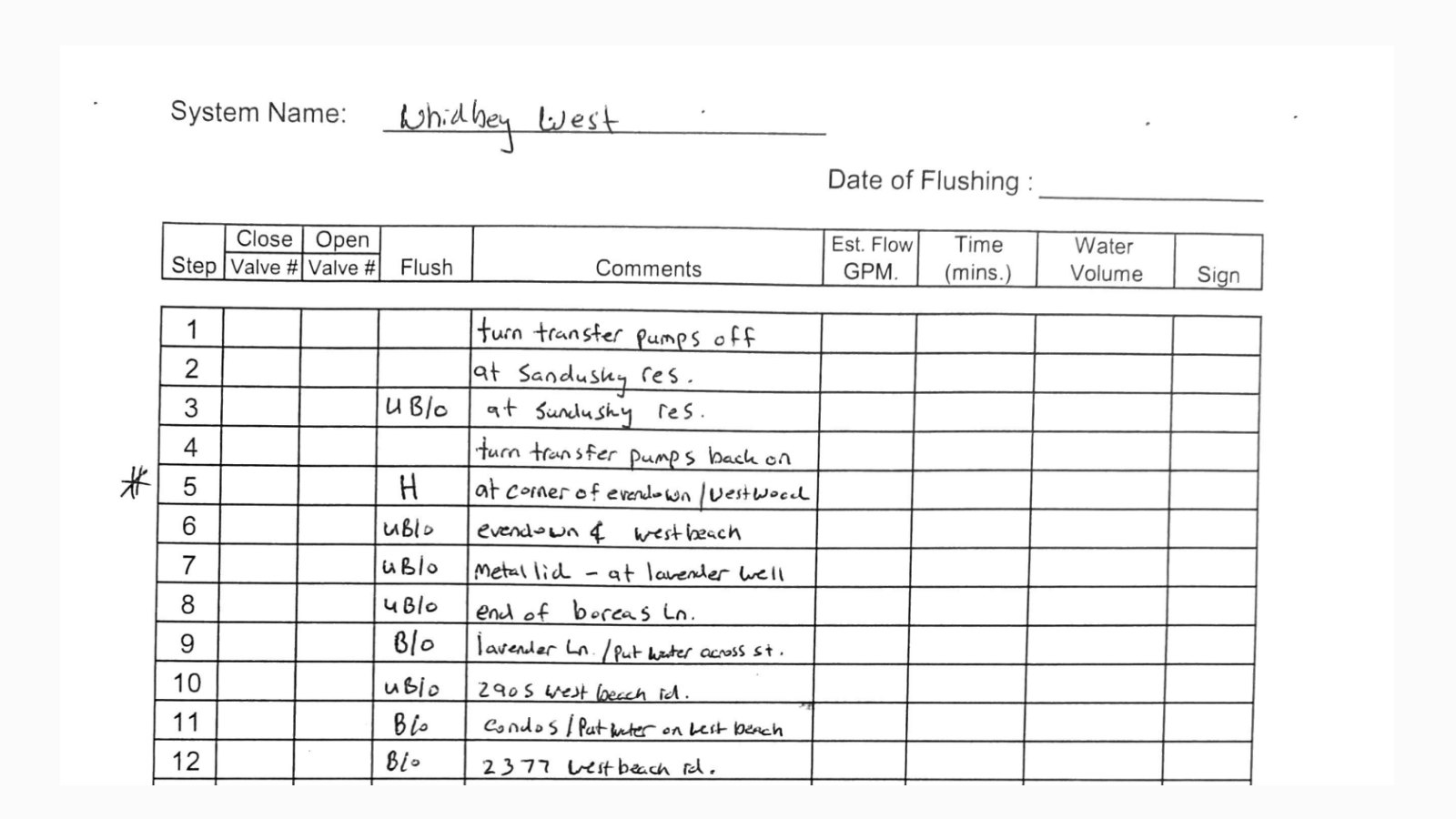
The second half of the story was prevention. We engaged with the mechanical engineering perspective to understand the actual water-system equipment: pumps, hydrants, tanks, labels, and the recurring inspections that help catch problems before residents feel them.
This turned a static maintenance document into a product artifact. The checklist was not just paperwork. It was a way to make field knowledge visible, repeatable, and easier to coordinate across people who maintain the system.
Inspect the physical system
Use equipment photos and existing maintenance material to understand what technicians actually check.
Structure recurring tasks
Translate dense maintenance documentation into clearer checklist categories and actions.
Connect field work to admin awareness
Make completed maintenance and issue notes easier to review later.
Treat preventive maintenance as a core product track, not a back-office appendix.
The checklist connected future prevention to the same service story as resident communication.
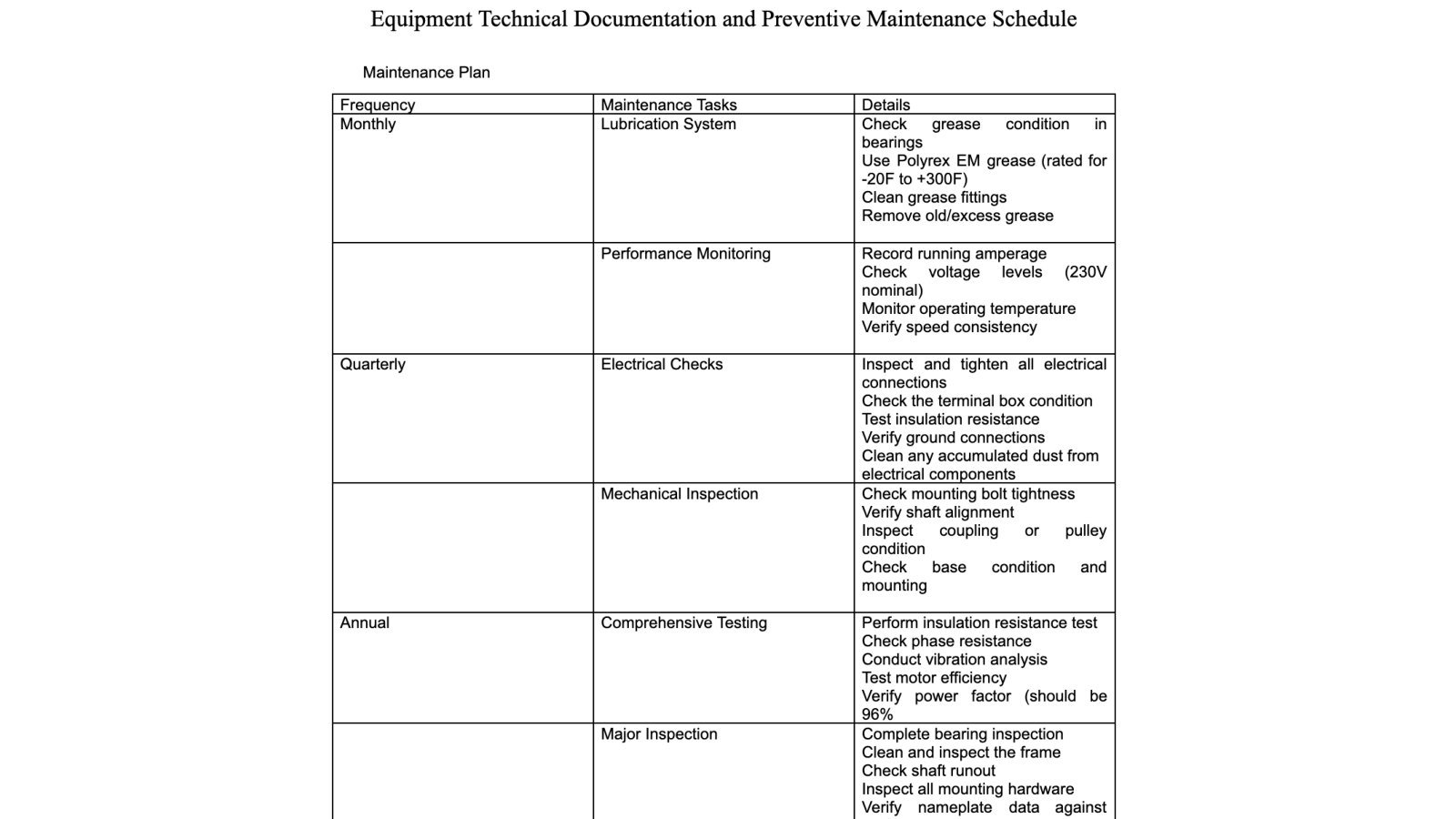
The redesign moved outage communication from scattered messages to a shared source of truth.
The before-and-after communication graphics were the turning point. In the old flow, residents could receive partial updates or hear about issues indirectly. In the new flow, admins had a clear place to publish alerts, residents had a place to check status, and issue reports could feed back into operations.
This changed the experience emotionally. Instead of wondering whether anyone knew about the problem, residents could see that the system had acknowledged the event and provided next steps.
Notify
Admins publish outage, maintenance, or water-quality updates through a consistent channel.
Guide
Residents receive plain-language status and know what action to take.
Collect
Reports from residents create a feedback loop instead of scattered complaints.
Make communication bidirectional: not only send alerts, but also make resident reports part of operational awareness.
The communication feature became the bridge between resident trust and system response.
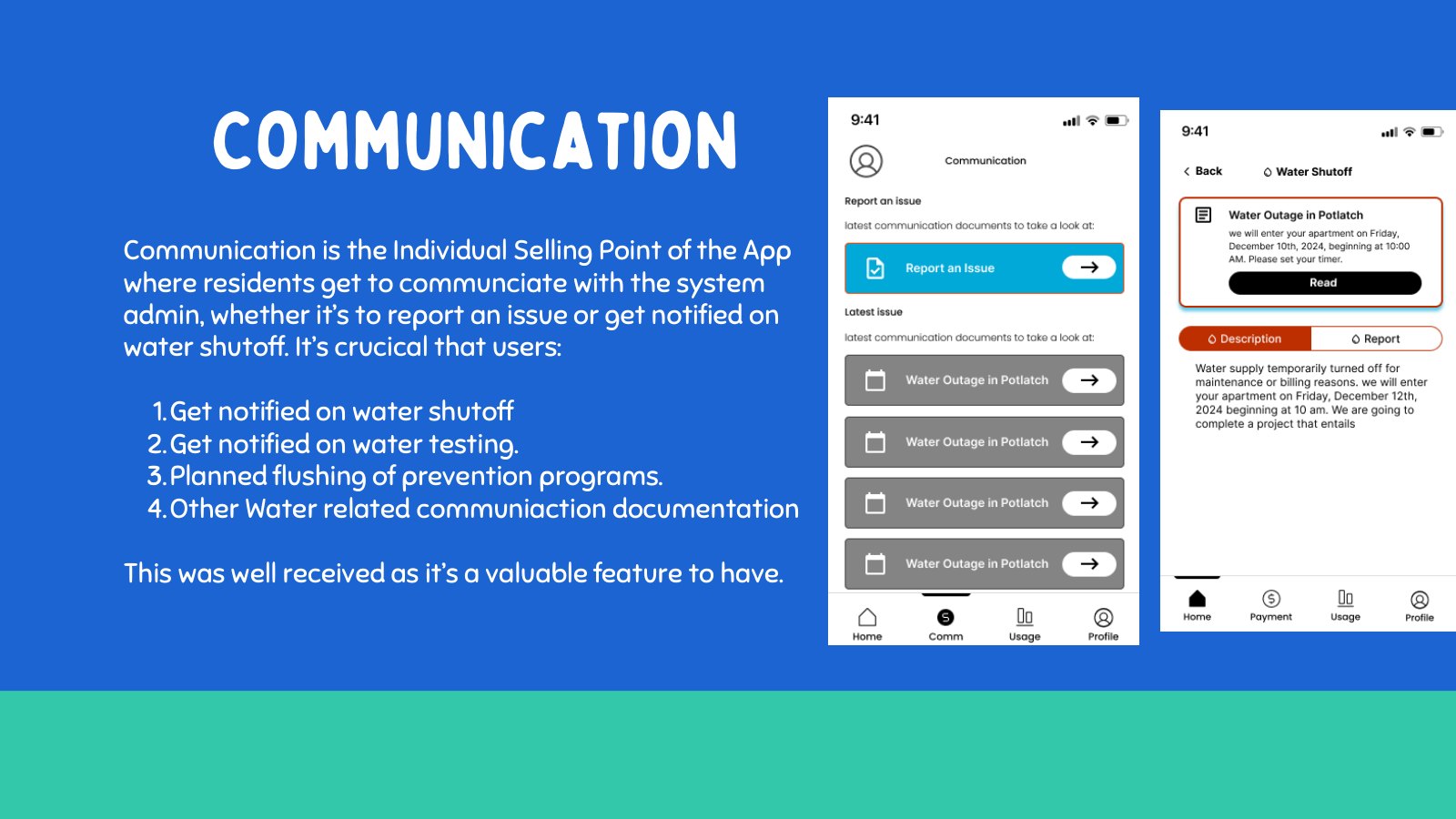
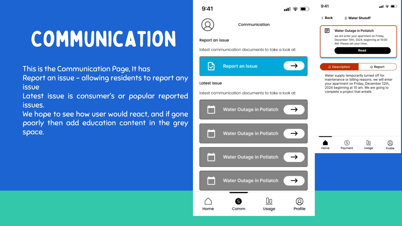
The prototype stitched alerts, reports, education, and usage context into one resident journey.
The Figma screens show the resident-facing side of the service. The home screen gives a starting point, communication screens explain what is happening, reporting screens help residents submit issues, education screens provide water guidance, and usage screens add context when residents want to understand patterns.
This was the product story in screen form: a resident opens the app because something is unclear, gets a status update, reports a problem if needed, learns what to do, and has enough context to feel informed rather than stranded.
Start with status
Give residents a quick sense of whether there is a current water event.
Move into action
Let residents report an issue without needing to know who to contact first.
Support understanding
Use education and usage context to help residents interpret what is happening.
Use the resident app as the visible layer of a larger service loop.
The screens became easier to follow because each one answered a moment in the resident story.
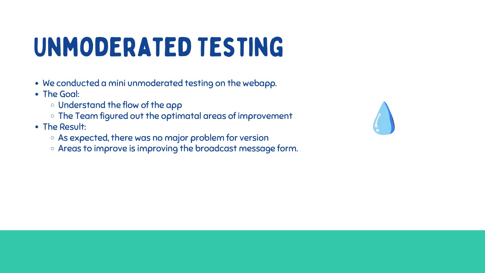
Testing helped remove noise and keep the MVP focused on water-critical moments.
Testing was used to compare feature importance and identify where the prototype should be simplified. Billing, usage history, education, communication, and reporting all appeared in the exploration, but the final story needed hierarchy: what matters most when residents are confused about water service?
The result was not that secondary features disappeared forever. It was that the MVP stopped pretending every feature was equally urgent. Communication and reporting carried the outage moment; education and usage provided support; billing moved lower in priority.
The fastest way to reduce confusion during outages and maintenance events.
A way for residents to turn their observations into actionable information.
Guidance helped residents understand water quality, maintenance, and preparation.
Keep the MVP centered on the service moments where clarity has the most impact.
The product became more coherent because testing pushed the team toward hierarchy, not feature volume.
The final journey connects prevention, detection, communication, and resident action.
The final case study story is a loop. Technicians perform maintenance checks to prevent problems. When issues happen, admins communicate quickly. Residents receive updates, report what they see, and understand what to do. Those reports and maintenance records help the water association improve the next response.
That is the cohesive story: the app is not only a resident interface. It is a shared operating model for a small water association trying to build trust around essential service interruptions.
Prevent
Maintenance checklists make inspections more consistent.
Detect
Technician notes and resident reports surface issues earlier.
Communicate
Admins send clearer alerts and updates from one place.
Improve
The system learns from reports, maintenance history, and resident needs.
Present the project as a service journey that solves both immediate communication and future prevention.
The impact is clarity for residents, better coordination for admins, and a more repeatable maintenance process for technicians.