Mobile App - (02/2020) - (09/2021)
How to help users spent time in nature while fostering user awareness and learning


Target User
18+
working Class
Interested in Nature
Outdoor users
Context
Mobile App
6 months of UX Design | Research
6 months of project assistant
Cross-collaborating for results.
My Role
UX Researcher
UX Designer
Project Assistant
Other roles as intended
When I Started
When I joined Nature Counter, the product was still in its early stages and lacked a clear design vision. Collaborating closely with the team, I became an integral part of the UX Research team and contributed to shaping key features, including the "Did you know?" section.
We started with talking to Stakeholder - What do you need from the app?
Stakeholder Meeting
The Two main objectives we got from the stakeholder meeting was:

Geofencing Location
A key party is keen to auto-monitor user's hours to optimize results in benefit assessment

Educating the users
The educational aspect of the app was crucial and needed focused attention.
Once we got key objective to track, then we moved to generative research to understand how the market looks: Market Research.
Market Research( Generative Research)
The team aimed to explore alternative solutions available in the mobile app store to identify potential competitors and opportunities.
Three main apps in the market were predominantly our learning focus:

INaturalist
Learn about the science in Nature
1. Record your observation
2. Community feature

Reconnect with Nature
Interact with the outdoors for positive impacts on your health 1. Quote of the Day
2. Weekend Activities

Nature Sounds
An outstanding array of premium nature audio is available for your
1. High Definition Natural Audio 2. Timer
After reconnecting with stakeholders and gathering everyone's opinions, we selected three features from the competition: Timer, Quote, and Community.
The question we sought to answer was: "What does the community want from a mobile app?" To address this, we conducted a survey.
Survey
Survey intention
we did the initial survey to learn more about the users and gather insights.
Age range
How would each range age users react to the app?

When going to park, do you take your phone with you?
To understand whether this mobile app could be actively used in park.

Frequency of Reading articles
we wanted to know how many of our users would be actively interested in articles, and other education material.

Time of Receiving Notification
Morning is the best time to receive notifications

Notification priority
users are interested in progress report, fun facts, and personal achievements.

Location
User will only "while using the app", thus the importance of tracking location data.

What we learned
Users expressed interest in features such as location tracking, sensitive notification groups, and highlighted that they often take their phones to parks. To gather feedback efficiently and minimize recruitment costs, we created low-fidelity wire frames and conducted usability testing paired with user interviews.
Low Fire wireframes
Here is where the logo screen is going to reside


The user should be onboarded with Setting an initial goal to keep the journey in place.
The landing page features a timing tracker and content page, which monitors time on a weekly basis, as well as a timer and an inspiring message for the user.


Upon user demand, we focused on providing a progress report that allows user to be up to date on their records.
Allowing the user to select their park of their choice.


Allows users to decline the user of location tracking.
Stakeholder intervened
The stakeholder wanted the location to be automatically tracked otherwise the technology would be useless.
There was an request to showcase important to education as well.

Record Activity
Give the user the ability to record activity manually and turn on location by default, with the capability to turn it off.
When a user onboards the app, there is information about the benefits of nature.

User Interview with lo-fi wireframes
We've constructed a medium-fidelity model to evaluate the wireframes and gather user responses. We reached back to those participants that registered via the survey.
1. What motivates the users to use the app?
2. Do they see the value in it?

Finding #1 : What motivates the user?
Health benefits
Send me articles through email, opt-out, and what's the catch?
Motivation
Not sure what the health benefits is, or understand it.
"I don't know what the benefits of being in nature is"
Don't sell my data
Connect your site to the most popular apps out there.
"please don't sell my data"
Notification
Users don't want to be bombarded with notifications and prefer articles over email.
"Wants to receive notifications 2-3 times a week max. Doesn’t want to be overloaded with notifications."
Gamification
Most of the time, users won't prefer gamification as the app runs in the background.
"I know the economics of tracking steps and the gamify of these apps. It's not worth it"
Music/podcast
Either the person loves music or listens to podcasts.
"Loves music. She listens to music, while in nature."
Finding #2: Did they see the value in it
Users also stated
Users preferred not to read extensive articles or educational content directly within the app. Instead, they favored receiving curated emails with links to articles and podcasts. This prompted us to adopt a more creative approach to meet their preferences.
MVP wireframes

We developed the "Did You Know?" feature, a combination of articles and podcast content. While users engaged with the material, they expressed a dislike for frequent article alerts. To address this, we condensed the information into digestible snippets, designed to raise awareness about the benefits of nature in a more user-friendly way.
Save articles, and read articles, at the users pace.


Dashboard
For the redesign of the app, we focused on three areas:
1. Did you know?
2. Edit the timer
3. Saving Articles
We must enlighten users about their advantages, and "did you know" is an effective educational tool as well.

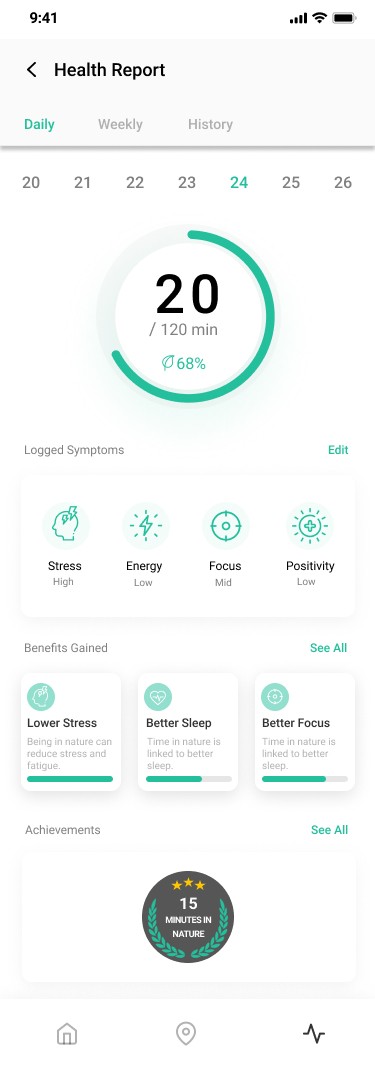
The group concentrated on three key areas:
1. Accomplishments
2. User-oriented symbols
3. Daily and Weekly History.
Unmoderated Testing
We conducted an unmoderated usability test at the last minute to identify potential improvements. The results showed a misclick rate of just 35%.

Lessons learned:

Limitation - Budget for User Research
we had to create pool of user groups and social media for recruitment purpose. user recruiting took time for surveys and user interviews.
