Survey-led discovery
We began with surveys to understand outdoor habits, phone usage in parks, motivation, notification comfort, and openness to nature education.
Mathews T Varghese
NatureCounter mobile app / UX research and product design
I led UX research and product design direction for NatureCounter, a mobile app that helps people track outdoor time, learn nature benefits in small doses, and stay motivated through lightweight progress loops. The work moved from open-ended stakeholder idea to researched, tested MVP.
Project overview
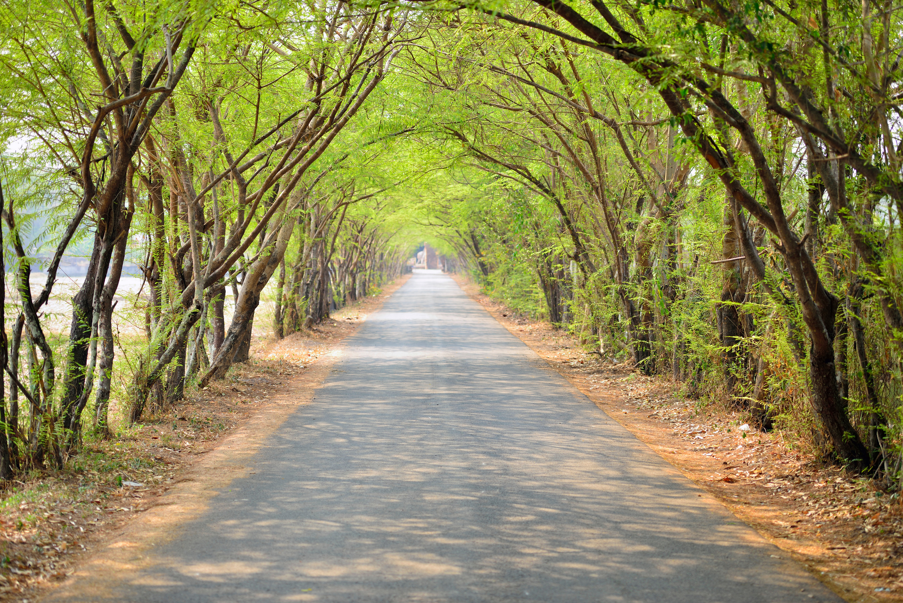
The hard part was making that feel trustworthy and useful. The app could not become a noisy fitness tracker, a content library, or a subscription product people would abandon. It needed to support a calmer habit: going outside, noticing the benefit, and returning again.
Phase 1 / Discovery and research
Surveys and exploratory research helped us understand user habits, motivation, phone use in parks, and comfort with location permission. The research question was not just whether people liked nature. It was what they would trust a mobile app to do while they were trying to spend time outside.
We began with surveys to understand outdoor habits, phone usage in parks, motivation, notification comfort, and openness to nature education.
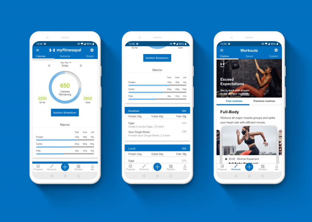
We reviewed nature, fitness, mapping, education, and wellness products to understand what people already expected from nature-related apps.
Reddit, YouTube, App Store reviews, and competitor comments helped surface objections around tracking, paywalls, motivation, and privacy.
The survey doubled as a recruiting funnel. It gave us signal, but also exposed a research challenge: interest did not always convert into test participation.
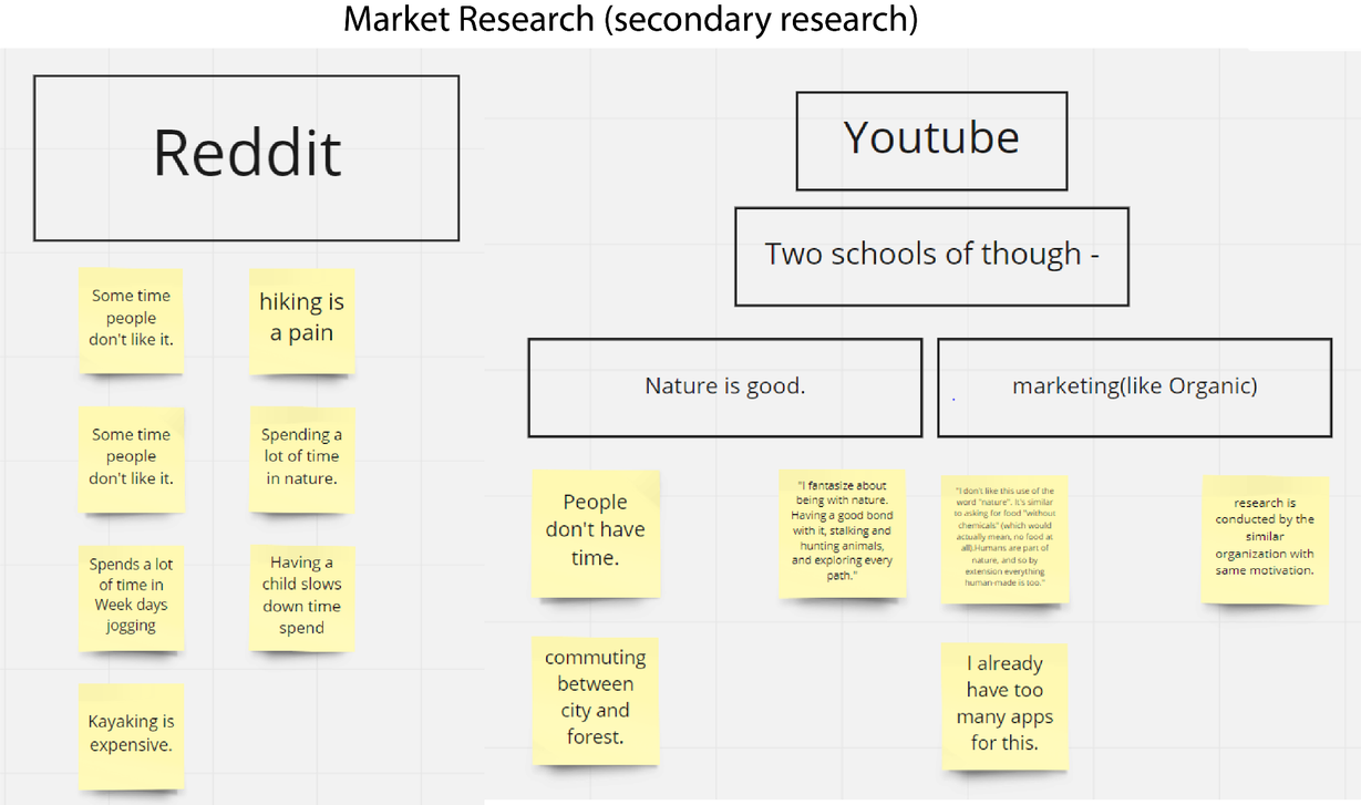
Market gap
Competitor apps offered beautiful sounds, images, audio, activity recording, species identification, or fitness tracking. What was missing was a simple loop that connected time outdoors, education, progress, and motivation without overwhelming the user.
Phase 2 / Design and iteration
The MVP took shape around two connected questions: how do users log nature time, and how do they learn without being pulled out of the moment? I explored IA, initial sketches, prototype screens, and repeated feedback loops to reduce scope while keeping the product meaningful.
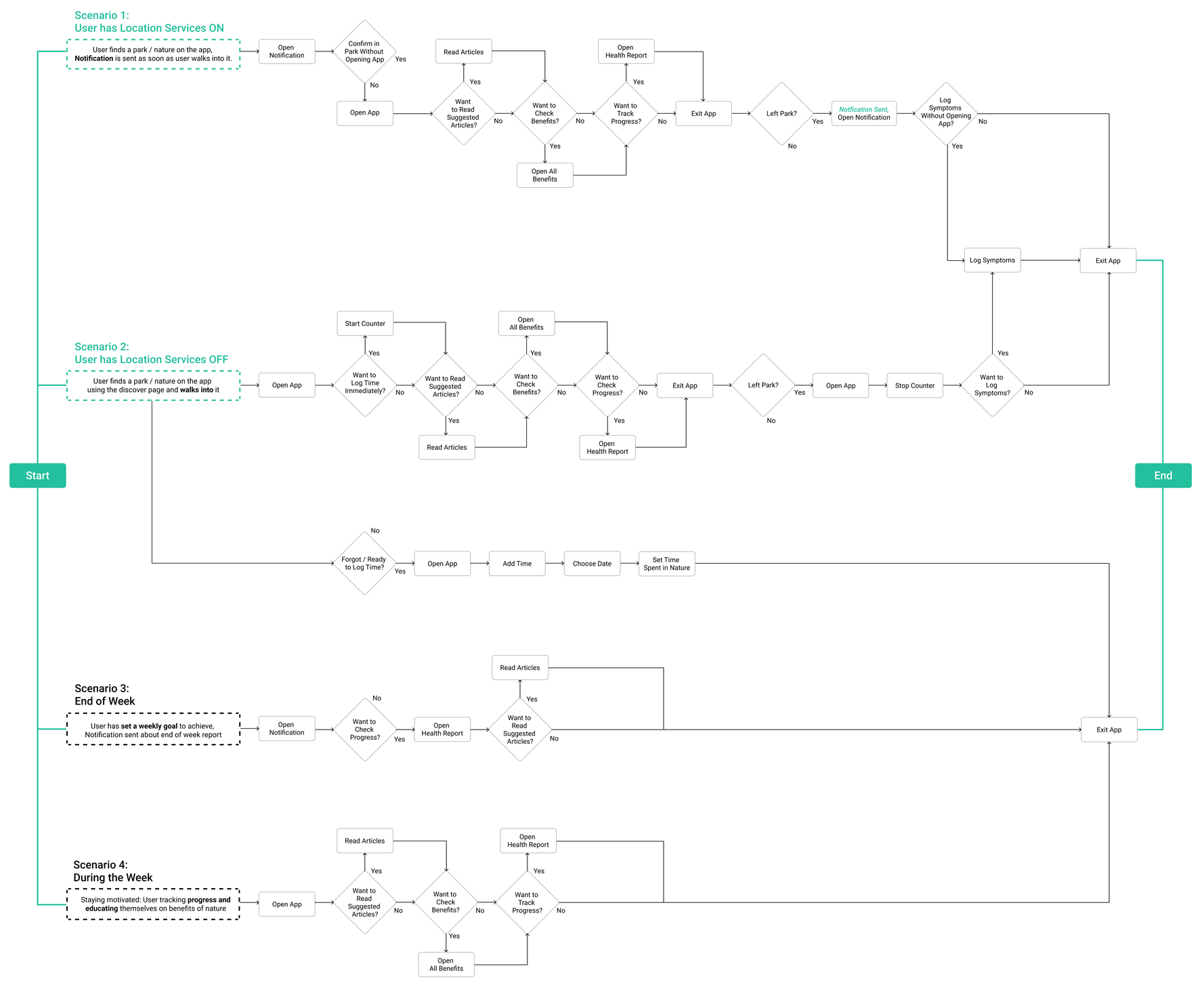
What changed from prototype to MVP
The early prototype leaned toward a generic tracking experience. The research pushed the product toward trust, manual control, shorter education, simpler navigation, and clearer progress feedback.
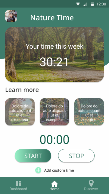
The earlier Home concept centered time tracking, but it did not clearly answer privacy, manual entry, education, or post-session reflection.
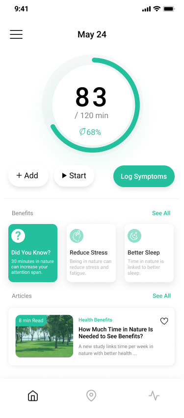
The circular tracker, + Add, Start, Log Symptoms, Did You Know, benefits, and articles became one connected journey.
Location permission created trust concerns, so the Home screen added a clear + Add path for users who wanted to enter time themselves.
Users were not interested in long articles during outdoor time, so education moved into quick Did You Know cards and a two-minute NatureDose concept.
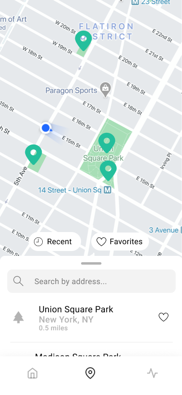
The early map experience carried too much complexity. The final version focused on Recents and Favorites so people could return to known nature spots faster.
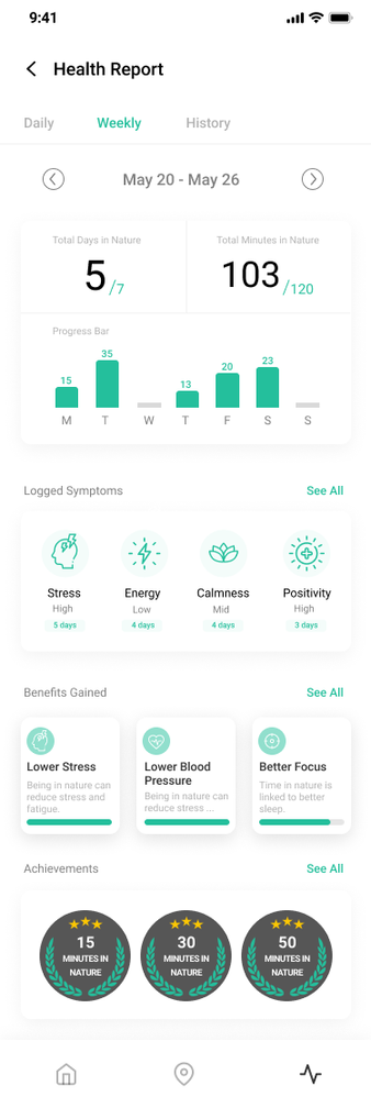
The final report screen connected minutes, symptoms, benefits, and badges so tracking had a meaningful payoff after the outdoor session.
MVP usability testing
Recruiting was not linear. Several people expressed interest and then dropped before testing, so the process had to keep moving with smaller rounds, faster iteration, and sharper task focus. The moderated tasks checked whether the MVP journey made sense before adding more features.
Start or add an outdoor session
Find a park or recent location
Understand a short nature benefit lesson
Review progress and motivation cues
I would use this if it is clear what happens to my location data.
I do not want another app sending me long articles while I am outside.
A quick reminder or small fact is useful. I just do not want it to feel like homework.
Two-minute NatureDose
Users did not want long articles interrupting the outdoor experience. Instead of forcing education into a reading-heavy flow, the MVP introduced a two-minute NatureDose: a short, focused learning moment that could teach one nature benefit quickly.
Research showed people were open to learning about nature benefits, but not if the content felt long, noisy, or disconnected from the outdoor session. The design response was to separate quick facts from deeper articles.
Motivation layer
Weekly checklists, badges, and progress reports were layered into the journey as optional motivation loops. They gave users a reason to return, but the core experience stayed grounded in personal progress, benefits, and control.
Small, repeatable goals helped translate outdoor time into a weekly rhythm.
Badges made progress visible without requiring a heavy social feed.
The report view connected symptoms, benefits, achievements, and weekly minutes so motivation stayed personal.
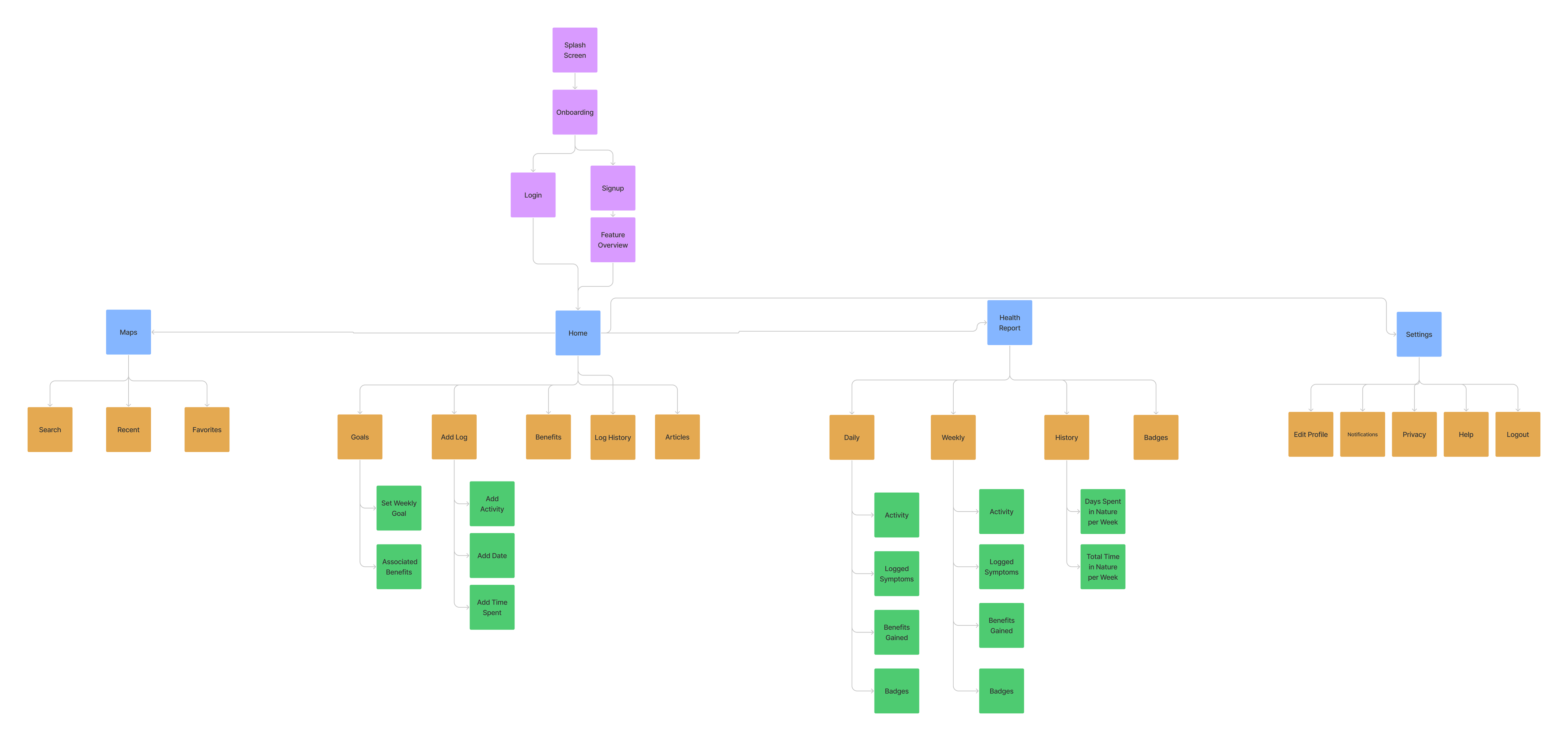
Final MVP
The slide deck’s final design centered the Home experience around the circular time tracker. The key changes were the manual Add action, Start control, Log Symptoms, a quick Did You Know education card, and article entry points placed lower on the page.
Circular time tracking, manual add, symptom logging, benefits, and article discovery in one screen.
Recent and favorite nature locations reduce friction and make repeat visits easier.
Weekly minutes, symptoms, benefits, and badges make progress visible after the visit.
Outcomes and next steps
The project clarified the market gap, defined a target audience, turned user concerns into product principles, and connected tracking with education and motivation. The biggest learning was that an app about nature needs restraint: the design should help users get outside, not keep them inside the app.